41

I'm Jin; I work on the designs for Stack Exchange sites as they graduate from the beta phase. Each site has its own representative branding that reflects its topic and culture, however, all sites share common elements so they feel like they are part of the Stack Exchange family. Once this design goes up, you will receive a link in the footer of other sites in the network, and you will gain the ability to migrate content to and from other sites.

Design Process

We've been working with the helpful design team at Salesforce.com for this community's site design. We wanted to come up with a design that's unique, but also reflects Salesforce's official branding. We collaborated on many of the site design elements from color scheme to logo. I'm a big fan of their Salesforce1 app design guide. Its clean and minimalistic style works very well for the design I had in mind.

Logo

Salesforce Stack Exchange Logo

The logo is inspired by the official Salesforce logo. The nodes and lines convey the cloud computing service Salesforce offers. The flat geometric shape and thin typeface combination provide a light and airy feeling.

The logo mark is versatile elsewhere too, not just for site use. For example, future promotional materials:
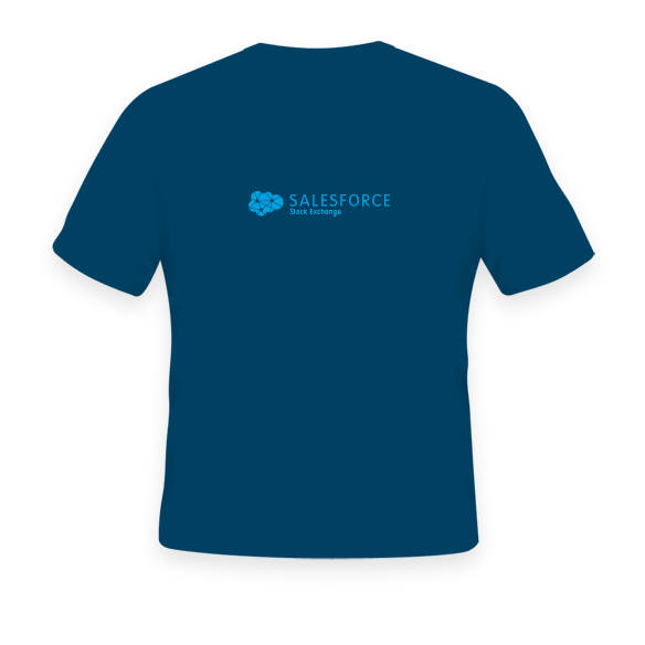

T-Shirt

Stickers!

Site Design

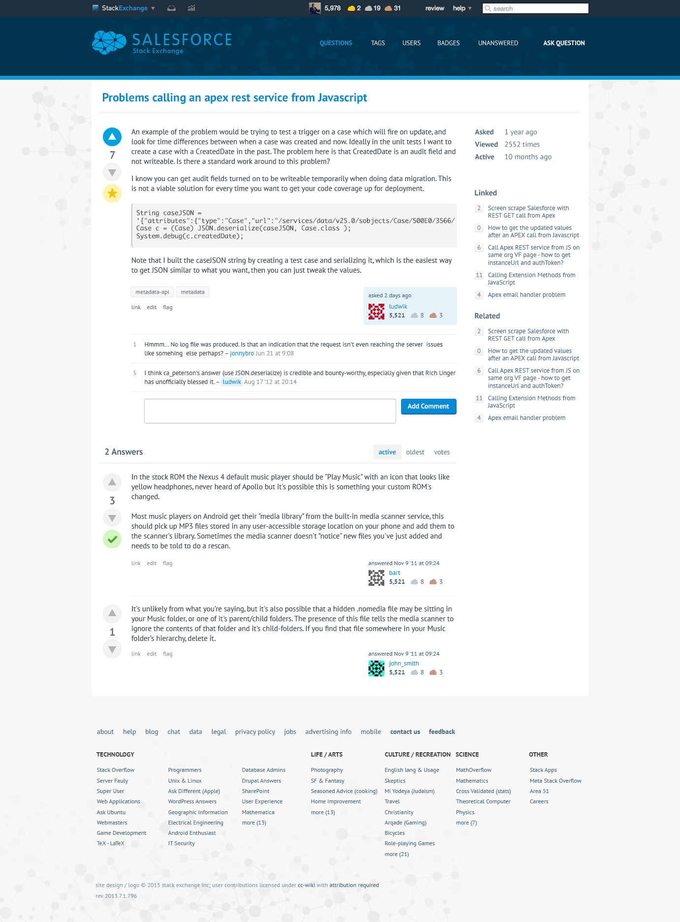
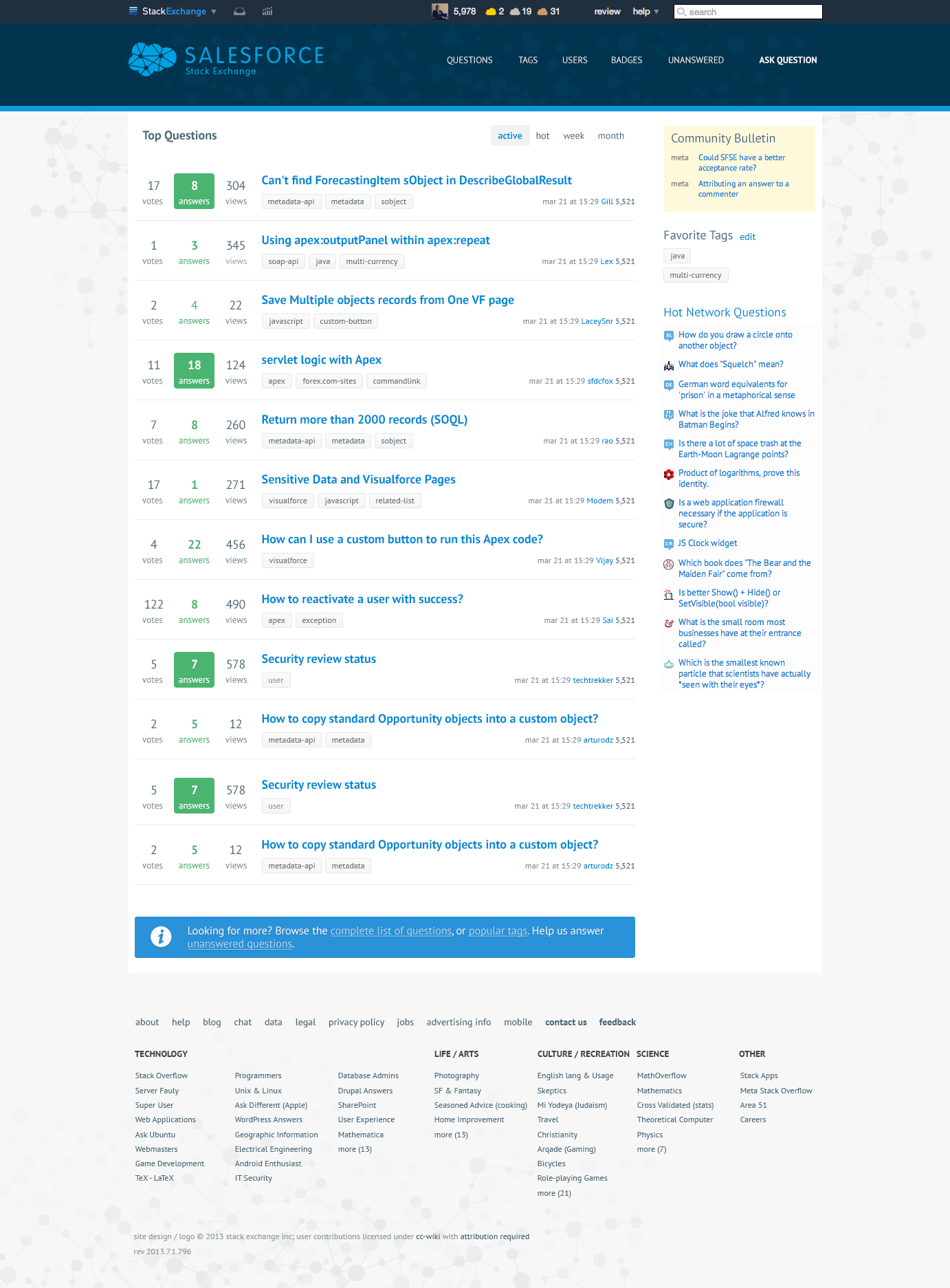
Please see the mockups below. While they do not contain all the site elements, they should give you a good overall look and feel of the new design. Click on the images below to see the full res versions.

Homepage

Homepage

Question page

Question Page

The overall look and feel is clean and elegant. The body content section is for readability without too much distraction. The dark blue header balances the minimalist look below. I used the color scheme from the Salesforce design guide. The font used is PT Sans, a gentle Humanist typeface.

I believe the branding and site design work very well for this community. It's unique and yet familiar to Salesforce devs and users. Assuming not too many major design changes based on your feedback, we'll launch the new design and graduate the site from Beta soon. An early congrats from me!

20
  • 4
    So awesome to finally see an update on this! Commented Sep 2, 2014 at 6:48
  • 8
    Awesome! I really like the logo and it sits very nicely on a t-shirt. Can't wait to get one :) Commented Sep 2, 2014 at 6:54
  • 8
    Looks fantastic - would love some of the stickers
    – pbattisson
    Commented Sep 2, 2014 at 7:39
  • 3
    I like the font and general design, but of the three color schemes you showed in the "logo" image, the one used in the lower-down mockup is the one I like the least. For me, I think it's the contrast between the two shades of blue - it seems the least legible and I find it hard to read the small blue text (while the white text is very legible). I'm not color blind AFAIK :)
    – jkraybill
    Commented Sep 2, 2014 at 8:30
  • Love the design, great job! Totally agree with your comment "I believe the branding and site design work very well for this community. It's unique and yet familiar to Salesforce devs and users." Look forward to stickers ;)
    – Doug Ayers
    Commented Sep 2, 2014 at 12:27
  • Very good! But something is wrong with a small badge icons? They are looking ... hmm.. strange? Commented Sep 2, 2014 at 12:35
  • 2
    This looks awesome! I am very excited to see it go live! I already have a spot on my laptop for the sticker! Commented Sep 2, 2014 at 14:15
  • Fantastic! Love it! Commented Sep 2, 2014 at 15:20
  • awesome ..Really cool.. Commented Sep 2, 2014 at 15:56
  • Stickers on T-shirts look awesome :) Commented Sep 2, 2014 at 15:57
  • 2
    Love the cloud badges! Commented Sep 2, 2014 at 16:38
  • This looks awesome! Cannot wait to get the stickers. Agree with @PeterKnolle too, the cloud badges are awesome. So glad this is finally happening!! Commented Sep 2, 2014 at 18:24
  • I love the way the logo combines 'cloud' and 'network'. Great job!
    – metadaddy Mod
    Commented Sep 2, 2014 at 23:21
  • What happens if we don't have the PT Sans font installed? Does it download as a webfont or do we fall back to Helvetica? I'm not really up with what the cool kids are doing with font-family tags these days. Commented Sep 3, 2014 at 0:10
  • 2
    @DanielBallinger it will be used as a webfont.
    – Jin
    Commented Sep 3, 2014 at 15:57

10 Answers 10

23

This looks great, I definitely think the minimalist design is the way to go. StackExchange is about the content.

I'm personally not a great fan of how a number of the other non-beta sites look, as I find their designs are too busy and that they distract from the content (english and rpg being the worst offenders).

Great work, I'm looking forward to getting some stickers!

PS. I think it's good that this design is close to the ux one, who better to follow for a good user experience!

3
  • Thank you for your feedback. Ha RPG was actually my favorite since I was able to go visual heavy for once. I think picking the right art style that suits a community's topic is the best way to approach design. For this community and several others, a clean and simple one is the way to go IMO.
    – Jin
    Commented Sep 8, 2014 at 5:08
  • I lik eit Gin - the dark blue is maybe a tad jarring but it's in line with the current dev platform branding so works well!
    – Matt Lacey Mod
    Commented Sep 10, 2014 at 1:03
  • 3
    ♥ I was pleasantly surprised with the new design.
    – sfdcfox Mod
    Commented Sep 11, 2014 at 20:32
3

I love the stickers.. But i certainly would like to have the light blue with white text on the site than the darkblue as it is currently in the mockup.

Maybe we have a another mockup with the light blue bg and white text and ask for a vote from the members ?

UPDATE

i.Image provided by jinenter image description here

4
  • 2
    When the header is light blue, the logo color choice would be either white or dark blue. I wanted the logo to be a color other than white so it can stand on its own. The white text on light blue didn't contrast well. Also having a darker logo doesn't look too great either. see i.imgur.com/mAf8auc.png
    – Jin
    Commented Sep 8, 2014 at 5:06
  • @Jin. If a light blue background were used, would you be able to add the white border around the logo as you've done with the stickers to help make the logo "pop"? I found the light blue background with white text much easier to read than the dark blue background with light blue text. I completely understand that its nearly impossible to "design by committee" and think you're doing a great job dealing with all our feedback. I thank you for your patience.
    – crmprogdev
    Commented Sep 10, 2014 at 12:50
  • Thanks @Jin for the mockup. the only concern i had with the dark blue background was the readability(its little hard on the eyes) as pointed out by crmprogdev. I like the suggestion of having the white border like in stickers. Thanks once again for the wonderful job
    – Prady
    Commented Sep 10, 2014 at 16:21
  • I like the original mockup better
    – greenstork
    Commented Sep 10, 2014 at 21:19
2

Maybe I'm missing something but I wish the code were displayed in a smaller font so there is less horizontal scrolling. It is hard to understand someone's problem if one has to either copy-paste into some other editor or horizontally scroll.

Most code posts easily extend past the viewport

1

I agree with @jkraybill. The dark blue background with light blue text doesn't have enough contrast for me. Have you tried reversing the two to use the light blue solid background with the darker text? I'd like to see how that would look. I also think the dark blue doesn't provide enough contrast between that band and the standard black StackExchange header at the very top. In that particular example, I think you may have also missed out on an opportunity to add some distinctive branding by omitting the white border around the networking logo.

I like the networking logo that you've created. Well done and distinctive from anything similar that I've seen. Is a nice change from the simple clouds that we're accustomed to seeing EVERYWHERE. LOL! I think that you worked with Salesforce on your design was a good thing in general.

At the same time, I think there's also something to be said for creating a style that's truly distinctive to SF.SE. I think it important to remember that people came here for a reason as opposed to staying on the SF Boards. I also think that now that SF has reorganized their boards, there's even more reason for people to come here instead (talk about bland, both in appearance and content).

One thing that I'd like to see is an obvious link to CHAT. That's something we've discussed here in meta. Its very difficult to find unless you already know where it is. As a consequence, chat is very underutilized on this site.

There's also been the suggestion to provide a sticky section with links to Developer Documentation on SF's Web Site in Possible to have a sticky section?. See my response to that question for more on the subject. I don't know if links to specific docs could be returned as related to the question or not. But that might be a nice feature to have that would save us a lot of time in looking up the links to documentation when answering a question.

From the same discussion, is there a way to provide links to tag WIKI's related to the question that's being asked that would show up at the top of the Related Questions list? That's a feature that I believe some of us would also like to see. See @PeterKnolle answer to Possible to have a sticky section?. Many thought this would also be a great help to us that would keep users on the SF.SE site; I suspect part of SE's goal in providing links.

I appreciate your asking for our input and taking the time to listen to what we have to say. That speaks highly of your organization and responsiveness to your users.

Thank you for all the obvious hard work and thought you're putting into this. I look forward to seeing this site graduating from beta in the near future. :)

1
  • Re. logo design, I don't see the point in putting networking in the cloud, it's self defeating, as the cloud is the network!
    – Bartley
    Commented Sep 3, 2014 at 7:31
1

Stop Press! Great Designwork Jin, how about giving consideration to a stronger identity between both StackExchange and Salesforce by also incorporating unique elements of each. Use the gradient blue element from the SE Logo in the Cloud and use the Salesforce font for the Salesforce name. enter image description here

1
  • 3
    The logo was approved by the official Salesforce design and legal team. The idea is to have "some" resemblance but not too much :)
    – Jin
    Commented Sep 5, 2014 at 13:28
1

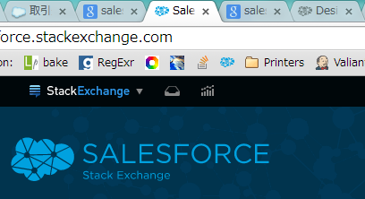
I am not sure if it is too late to provide feedback, but here it is anyway:

I find that the logo does not look very nice in the browser tab and on the browser bookmark bar (see image attached). I think this is because the "network" lines in the logo are transparent. When put on a gray background, the low contrast makes the logo lose its shape and it looks a bit messy. I wonder if one of the follow might fix my complaint:

  1. Use a version of the logo which does not use transparent lines
  2. Use one of the versions of the logo which are a solid colour (like the ones used to represent the badges)

enter image description here

Apart from that, I really like the design. Nice job.

0

I thank you for the hard time, and I am defo not a UX guy or a designer, but this one is boring IMO. Minimalistic is fine, but what about some more color? I know other SO sites have unique, colorfull, schemes. How bout adding some here?

Maybe its just too close to the beta design we already have, and i was looking for a change, once we graduate?!

Its awesome to know that SF design team were involved on the process.

An idea:in sf, each object has its own icon, and color, maybe add something like that?

Again, i really appreciate your work, and I am Not sure what i miss, but if we had a chance to vote on design concept, i dont think i would on this one.

3
  • 3
    Maybe its just too close to the beta design we already have - it is... Commented Sep 2, 2014 at 12:52
  • 1
    The opinions on this seem pretty split (5 up votes, 5 down votes) but I do have to say I might agree with you after more consideration. This does seem a bit 'out of the boxish' and maybe a bit more customization that is specific to SF and something that will stand out a bit more. Commented Sep 4, 2014 at 15:42
  • 2
    The ootb design is great - clean, clear and unobtrusive. I wouldn't want to go radically different from it just for the sake of it. I find some of the other SEs I frequent have over the top designs that distract me a little. I may just be easily
    – Dominic
    Commented Sep 5, 2014 at 10:32
0

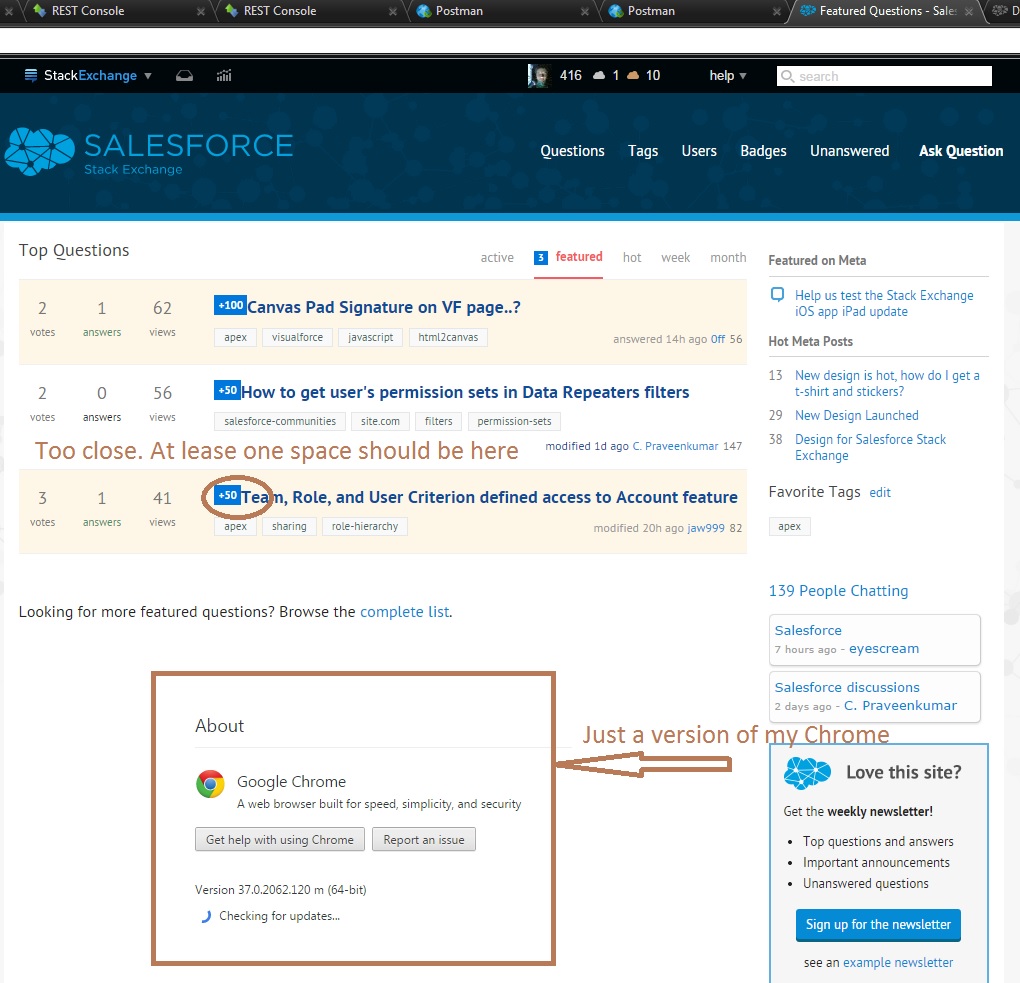
Sorry, if it's totally OK for others.

Too close

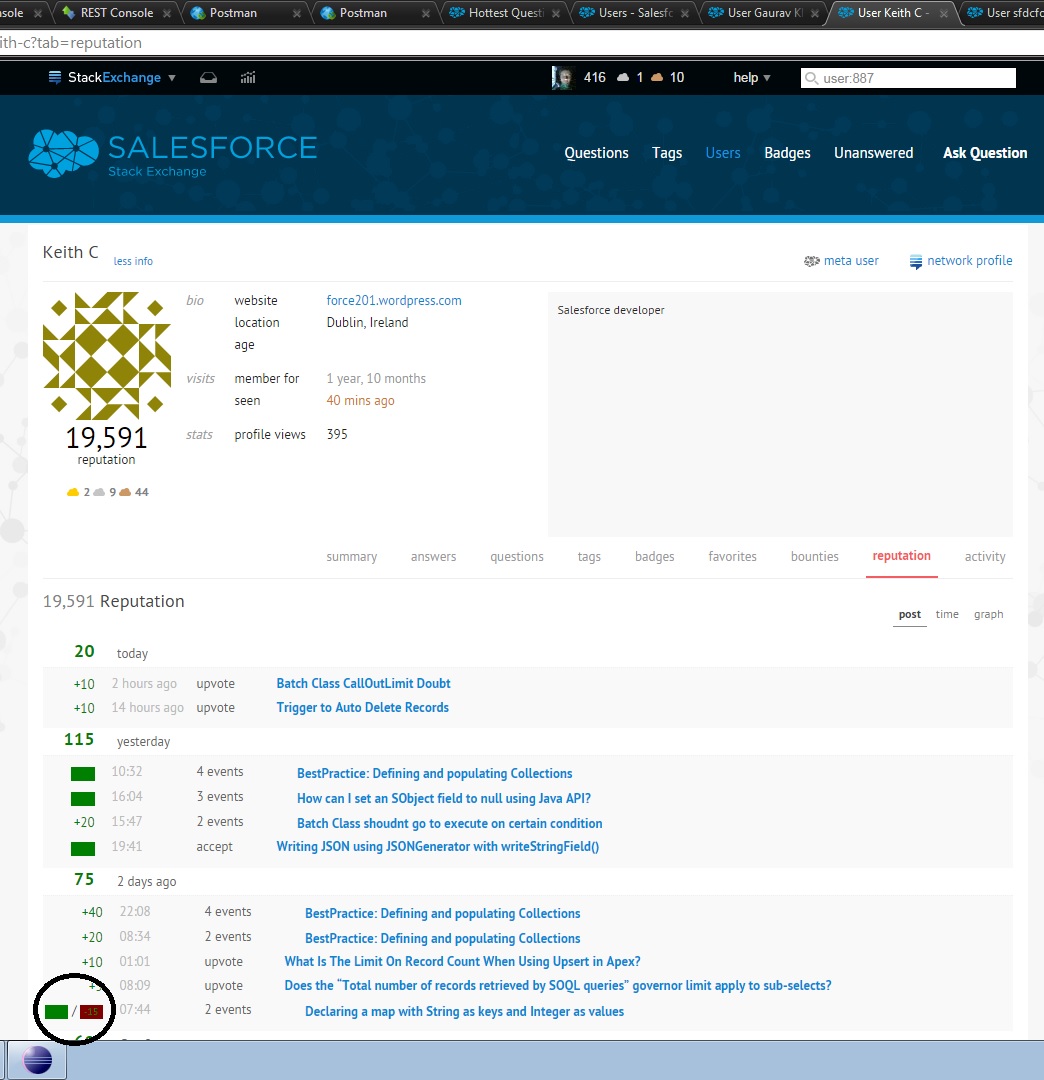
Another issue

2
  • 1
    yep I already fixed this spacing issue on dev. The change will go live after our next production build.
    – Jin
    Commented Sep 12, 2014 at 14:32
  • @Jin, I found another misunderstanding Commented Sep 12, 2014 at 15:12
-2

My design two cents, and I don't mean to be insulting to anyone, but the first thing that comes to mind when seeing the bronze "cloud" badge is dog poo.

-4

blueblueblueblueblueblueblueblueblueblueblueblueblueblueblueblueblueblueblueblueblueblueblueblueblueblueblueblueblueblueblueblueblueblueblueblueblueblueblueblueblueblueblueblueblueblue...


How about red? Orange? Yellow?

Brown?

Notblue?

There's nothing wrong with blue, but the whole page looks... cool. It needs a contrasting secondary color.

You must log in to answer this question.

Not the answer you're looking for? Browse other questions tagged .